实现内凹圆角+阴影效果
说起优惠券,UI 设计稿中经常会出现这样子的图形,长方形、带缺口、带向外的阴影:
 简单的优惠券
 漂亮的优惠券
前端实现内凹圆角,无论遮挡还是径向透明渐变,都需要用额外的元素,还要在定位上要花费不少工夫。
而在此基础上还要带阴影,想想都觉得是一件挺难的事。我此前没有见过相关的实现,最近稍微研究了一下。
大致的实现思路是:用 clip-path + csv 做图片的裁减,然后用 filter 的 drop-shadow 做阴影(兼容性可能会很差,但先实现出来再算吧)。
抱着这种想法,花了三个小时做出以下效果:
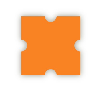 内凹圆角+阴影
下面是具体实现:
  <svg style="position: absolute;" width="0" height="0" viewBox="0 0 100 100">
    <defs>
      <clipPath
        id="clip-shape"
        clipPathUnits="objectBoundingBox"
      >
        <path
          d="M 0 0 L .4 0 A .1 .1 0 0 0 .6 0 L 1 0 V .4 A .1 .1 0 0 0 1 .6 V 1 H .6 A .1 .1 0 0 0 .4 1 H 0 V .6 A .1 .1 0 0 0 0 .4 Z">
        </path>
      </clipPath>
    </defs>
  </svg>
  <span class="shape-wrap">
    <span class="shape"></span>
  </span>
首先定义一个 svg 的 clipPath 元素,在 css 样式中会以 clip-path: url('#clip-shape') 形式引用它。
这个 clipPath 元素内包含一个 path 标签,它长这样,应用了 clipPath 之后,所有在路径之外(即白色部分)的都会被剪除:
 路径
路径
这个路径是手动画的。画 svg 的路径说难也不难,可以先到 MDN补习一下相关命令。
推荐一个画路径的在线网站,它会让画路径变简单很多。
画路径时基于固定尺寸的坐标系,画出来的路径大小是固定的。你画出来的路径是 100 * 100 的,用它来裁剪其他图形,最终裁剪得到的也是 100 * 100 的图形。
怎样才能让它的大小灵活变化呢?答案就在 clipPath 的 clipPathUnits 属性。它默认是 userSpaceOnUse ,应用此值时 clipPath 内所有元素的尺寸都是元素被创建时的尺寸;而另一个值是 objectBoundingBox ,应用此值时 clipPath 内所有元素的尺寸都是相对 clipPath 被应用的元素来说的,因此,所有在 clipPath 内的元素,其位置数值都在 0 到 1 之间。
除了 svg 之外,还有两个 span 元素。把 clipPath 应用在 .shape 元素上,而把 filter: drop-shadow 应用在其外层的 .shape-wrap 元素上。之所以不把 filter: drop-shadow 应用在 .shape 元素上,是因为这样做的话阴影不会跟随内凹的圆角:
body {
  height: 100vh;
  display: grid;
  place-items: center;
  margin: 0;
}
.shape-wrap {
  filter: drop-shadow(0px 0px 10px rgba(50, 50, 0, 0.5));
}
.shape {
  display: block;
  background: #FB8C00;
  width: 200px;
  height: 200px;
  clip-path: url('#clip-shape');
}
参考